Line Chart
What is a Line Chart?

A line chart is the graphical representation of the functional relationship of two (with 2D representation) or three (with 3D representation) characteristics as a diagram in line form, whereby changes or developments (for example within a certain period of time) can be represented. In contrast to the scatterplot, there can only be one pair or trio of values at a time. If enough data points are collected during a measurement, these points are usually ordered on the x-coordinate and can be connected by drawing line segments between them. Line charts are usually used in identifying the trends in data.
Info
The lines() function adds information to a graph. It can not produce a graph on its own.
Usually it follows a plot(x, y) command that produces a graph.
By default, plot( ) plots the (x,y) points. Use the type="n" option in the plot( ) command, to create the graph with axes, titles, etc., but without plotting the points.
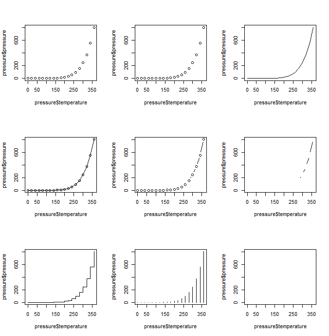
type= can take the following values:
| type | description |
|---|---|
| p | points |
| l | lines |
| o | overplotted lines and points |
| b | points joined by lines |
| c | no visible points (empty) joined by lines |
| s, S | line-like stair steps |
| h | histogram-like vertical lines |
| n | does not produce any points or lines |
Example with mtcars:
By default the plot() function produces a scatter plot with dots. To make line graphs, pass it to the vector of x and y values, and specify the type = " ":
plot(x = pressure$temperature, y = pressure$pressure)                  # 0.
plot(x = pressure$temperature, y = pressure$pressure, type = "p")      # 1.
plot(x = pressure$temperature, y = pressure$pressure, type = "l")      # 2.
plot(x = pressure$temperature, y = pressure$pressure, type = "o")      # 3.
plot(x = pressure$temperature, y = pressure$pressure, type = "b")      # 4.
plot(x = pressure$temperature, y = pressure$pressure, type = "c")      # 5.
plot(x = pressure$temperature, y = pressure$pressure, type = "s")      # 6.
plot(x = pressure$temperature, y = pressure$pressure, type = "h")      # 7.
plot(x = pressure$temperature, y = pressure$pressure, type = "n")      # 8.
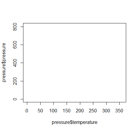
To include multiple lines or to plot the points, first call plot() for the first line, then add additional lines and points with lines() and points() respectively:
# base graphic
plot(x = pressure$temperature, y = pressure$pressure,
  type = "l", col = "steelblue")

# add points
points(x = pressure$temperature, y = pressure$pressure, col = "steelblue")

# add second line in red color
lines(x = pressure$temperature, y = pressure$pressure/2, col = "darkgreen")

# add points to second line
points(x = pressure$temperature, y = pressure$pressure/2, col = "darkgreen")
Example with orange:
To demonstrate the creation of a more complex line chart, let’s plot the growth of 5 orange trees over time. Each tree will have its own distinctive line. The data come from the dataset Orange.
# convert factor to numeric for convenience
Orange$Tree <- as.numeric(Orange$Tree)
ntrees <- max(Orange$Tree)
# get the range for the x and y axis
xrange <- range(Orange$age)
yrange <- range(Orange$circumference)
# set up the plot
plot(xrange, yrange, type="n", xlab="Age (days)",
     ylab="Circumference (mm)" )
colors <- rainbow(ntrees)
linetype <- c(1:ntrees)
plotchar <- seq(18,18+ntrees,1)
# add lines via for-loop
for (i in 1:ntrees)
{
  tree <- subset(Orange, Tree==i)
  lines(tree$age, tree$circumference, type="b", lwd=1.5,
        lty=linetype[i], col=colors[i], pch=plotchar[i])
}
# add a title and subtitle
title("Tree Growth")


# add a legend
legend(xrange[1], yrange[2], 1:ntrees, cex=0.8, col=colors,
       pch=plotchar, lty=linetype, title="Tree")