Histogram & Density Plot
What is a Histogram?

A histogram is a graphical representation of the frequency distribution of cardinally scaled characteristics. It requires the division of the data into bins (classes), which can have a constant or variable width (see image on the right by DanielPenfield) on wikimedia.org. Directly adjacent rectangles of the width of the respective class are drawn, the area of which represents the (relative or absolute) class frequencies. The height of each rectangle then represents the (relative or absolute) frequency density, i.e. the (relative or absolute) frequency divided by the width of the corresponding class.
Build in Datasets
R comes with several built-in data sets, which are generally used as demo data for playing with R functions. These built-in data sets are ideal for practising plotting. To see the list of pre-loaded data, type the function data():
- “mtcars”: Motor Trend Car Road Tests
- “iris”: measurements for 50 flowers from each of 3 species of iris
- “ToothGrowth”: effect of vitamin C on tooth growth in Guinea pigs
- “PlantGrowth”: results of an experiment to compare yields
- “USArrests”: statistics about violent crime rates by us state
- and many many more…
Reminder
- Load a built-in R data set:
data(“dataset_name”) - Inspect the data set:
head(dataset_name)
Theory
You can create histograms with the function hist(x) where x is a numeric vector of values to be plotted. The option freq=FALSE plots probability densities instead of frequencies. The option breaks= controls the number of bins.
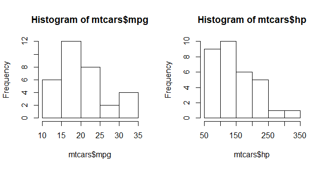
Simple Histogram with the dataset mtcars. If you want to learn more about mtcars, type this: ?mtcars
# Loading dataset
data(mtcars)

# creating histograms with mpg = US Miles per gallon and hp = horsepower
mpg <- hist(mtcars$mpg)
hp <- hist(mtcars$hp)
Histogram with Breaks (Bins) and Color
hist(mtcars$mpg, breaks=10, col="red")
hist(mtcars$hp, breaks=6, col="blue")
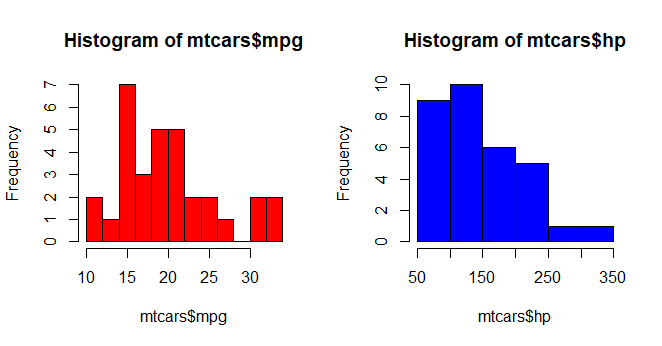
Histograms can be a poor method for determining the shape of a distribution because it is so strongly affected by the number of bins used.
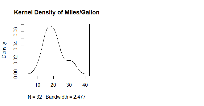
Kernel Density Plots
Kernal density plots are usually a much more effective way to view the distribution of a variable. Create the plot using plot(density(x)) where x is a numeric vector.
d <- density(mtcars$mpg) # returns the density data
plot(d, main="Kernel Density of Miles/Gallon") # Unfilled Density Plot
polygon(d, col="red", border="blue") # Filled Density Plot