
Creating graphs
“No design works unless it embodies ideas that are held common by the people for whom the object is intended.” - Adrian Forty
The use of R offers many advantages not only in the analysis of data, R is also a useful tool for creating scientific graphs. R makes it possible
- to produce high quality graphs that are also suitable for professional printing.
- to create graphics completely in R syntax and thus make them reproducible. reproducible.
- to flexibly combine different types of graphics or develop your own forms of presentation.
- to easily create uniformly designed graphics.
Do not wait until the very final analysis stage to produce some publication quality graphics but produce fast (not necessarily nice) visualizations all the way through your data analysis. Otherwise you will not utilize the best neural network infrastructure you have available: your brain and it’s ability to identify patterns.
Basic plots in R
plot(x,y) is the universal function for generating scatter plots and line plots from the vectors x and y. plot can be optionally adjusted with various parameters:
| Parameter | Description | Example |
|---|---|---|
| type | sets the diagram type: “l” -> lines “p” -> dots “b” -> both points and lines “c”-> empty points joined by lines “h” -> bars, histogram-like vertical lines “s” -> step diagram “n” -> no representation, does not produce any points or lines |
type=”b” |
| main | name of title | main=”Population growth (annual %)” |
| col | set colour for lines, dots, bars etc. show available colour words: colours() |
col=”blue” col=”#112233” (RGB value) col=”#11223344” (RGB and transparency value) |
| sub | subtitle, caption | sub=”Figure 1” |
| xlab | labelling of the x-axis | xlab=”Years 2000 to 2020” |
| ylab | labelling of the y-axis | ylab=”Population Growth in %” |
| pch | The graphic symbol used to represent data points. Either a character as a string or a number representing the following characters;  |
pch=1 |
| lty | Stroke type of lines  |
lty=1 |
| lwd | Line width | lwd=3 |
| cex | Symbol size | cex=2 |
| xlim | Sets start and end values of the X-axis scale | xlim=c(0,20) |
| ylim | Sets start and end values of the y-axis scale | ylim=c(100,160) |
| bty | Outline of the complete character area. Options are: “n”, “o”, “c”, “l”, “7” | bty=”n” |
| xaxt | Labelling of the X-axis scale OFF | xaxt=”n” |
| yaxt | Labelling of the Y-axis scale OFF | yaxt=”n” |
| font | Selection of the font format, 1=plain, 2=bold, 3=italic, 5=Greek symbols | font=5 |
| “Pointcharacters as used in GNU R” by Marc Schwenzer on Wikimedia “Line-Styles of GNU R” by Europol on Wikimedia |
Let’s have some fun
The following is an introduction for producing simple graphs.
Define 2 vectors for two different datasets:
sport_cars <- c(1, 2, 4, 2, 6, 7, 10)
family_cars <- c(3, 6, 6, 8, 6, 5, 2)
Then calculate the range from 0 to max value of sport cars and family cars:
max_range <- range(0, sport_cars, family_cars)
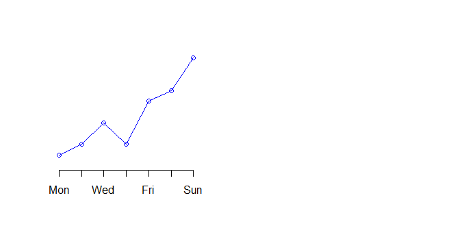
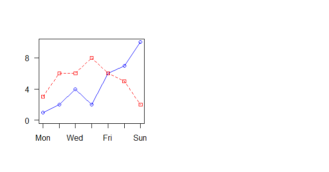
We graph the cars using the y axis that ranges from 0 to max value in sports or family cars and turning off axes and annotations (axis labels) so we can specify them ourself.
plot(sport_cars, type="o", col="blue", ylim=max_range,
     axes=FALSE, ann=FALSE)

Make x axis using Mon-Fri labels
axis(1, at=1:7, lab=c("Mon","Tue","Wed","Thu","Fri","Sat","Sun"))
Make y axis with horizontal labels that display ticks at every 4 marks. 4*0:g_range[2] is equivalent to c(0,4,8,12).
axis(2, las=1, at=4*0:max_range[2])
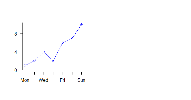
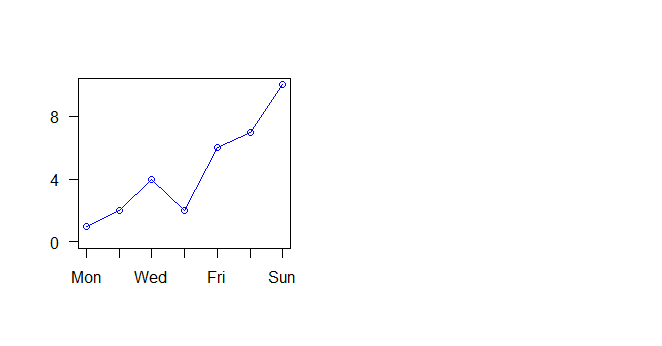
Create box around plot
box()
Graph trucks with red dashed line and square points
lines(family_cars, type="o", pch=22, lty=2, col="red")
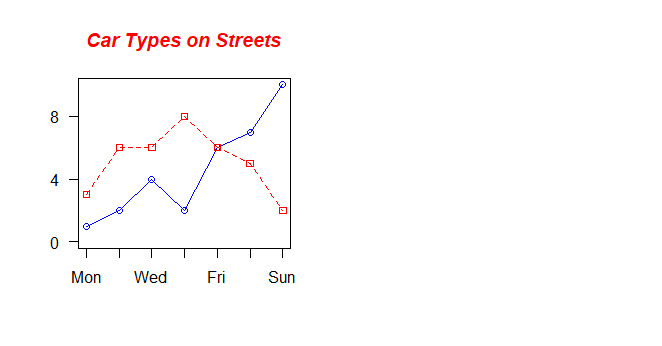
Create a title with a red, bold/italic font
title(main="Car Types on Streets", col.main="red", font.main=4)
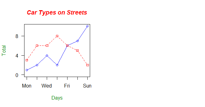
Label the x and y axes with dark green text
title(xlab="Days", col.lab=rgb(0,0.5,0))
title(ylab="Total", col.lab=rgb(0,0.5,0))
Create a legend at (1, g_range[2]) that is slightly smaller (cex) and uses the same line colors and points used by the actual plots
legend(1, max_range[2], c("Sport","Family"), cex=0.8,
       col=c("blue","red"), pch=21:22, lty=1:2);
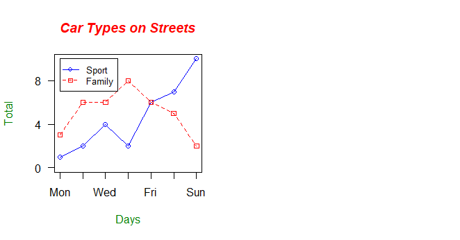
In total this is the code and the output in the plot-window will look like this with each line:
sport_cars <- c(1, 2, 4, 2, 6, 7, 10)
family_cars <- c(3, 6, 6, 8, 6, 5, 2)
max_range <- range(0, sport_cars, family_cars)
plot(sport_cars, type="o", col="blue", ylim=max_range,
     axes=FALSE, ann=FALSE)
axis(1, at=1:7, lab=c("Mon","Tue","Wed","Thu","Fri","Sat","Sun"))
axis(2, las=1, at=4*0:max_range[2])
box()
lines(family_cars, type="o", pch=22, lty=2, col="red")
title(main="Car Types on Streets", col.main="red", font.main=4)
title(xlab="Days", col.lab=rgb(0,0.5,0))
title(ylab="Total", col.lab=rgb(0,0.5,0))
legend(1, max_range[2], c("Sport","Family"), cex=0.8,
       col=c("blue","red"), pch=21:22, lty=1:2);

Visualizations 101
No matter if you produce publication quality graphics or quick and dirty visualizations, remember some guiding principles and traps illustrated in the upcoming figures.
For further reading, have a look at e.g. Kelleher & Wagner 2011. To get some inspiration, the R Graph Gallery is also a good place to start (but it relies on the ggplot2 library, not on the basic R plotting functions).