Barplot
What is a Barplot?
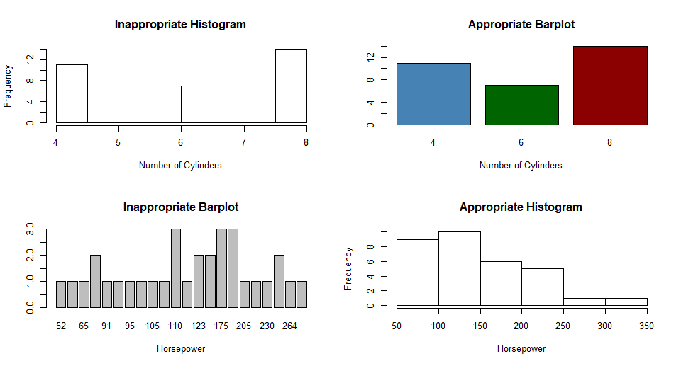
The barplot is for comparative representation that illustrates the frequency distribution of a discrete (random) variable by means of non-contiguous columns standing vertically on the x-axis. The bar chart is particularly suitable for illustrating up to approx. 15 characteristics. With more categories, the clarity suffers and line charts are to be preferred. The bar chart is also not suitable in the case of metrically continuous data; then a histogram is preferable.
</div>
Create barplots with the barplot(values) function, where values is a vector or matrix.
- If values is a vector, the values determine the heights of the bars in the plot.
- If values is a matrix and the option
beside=FALSEthen each bar of the plot corresponds to a column of height, with the values in the column giving the heights of stacked “sub-bars”. - If height is a matrix and beside=TRUE, then the values in each column are juxtaposed rather than stacked.
- Include option
names.arg=(character vector)to label the bars. - The option
horiz=TRUEto createa a horizontal barplot.
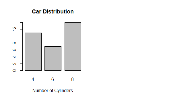
Example with mtcars:
data(mtcars)
counts <- table(mtcars$cyl)
barplot(counts, main="Car Distribution",
        xlab="Number of Cylinders")
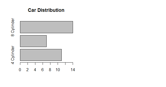
Simple Horizontal Barplot with Added Labels
counts <- table(mtcars$cyl)
barplot(counts, main="Car Distribution", horiz=TRUE,
        names.arg=c("4 Cylinder", "6 Cylinder", "8 Cylinder"))
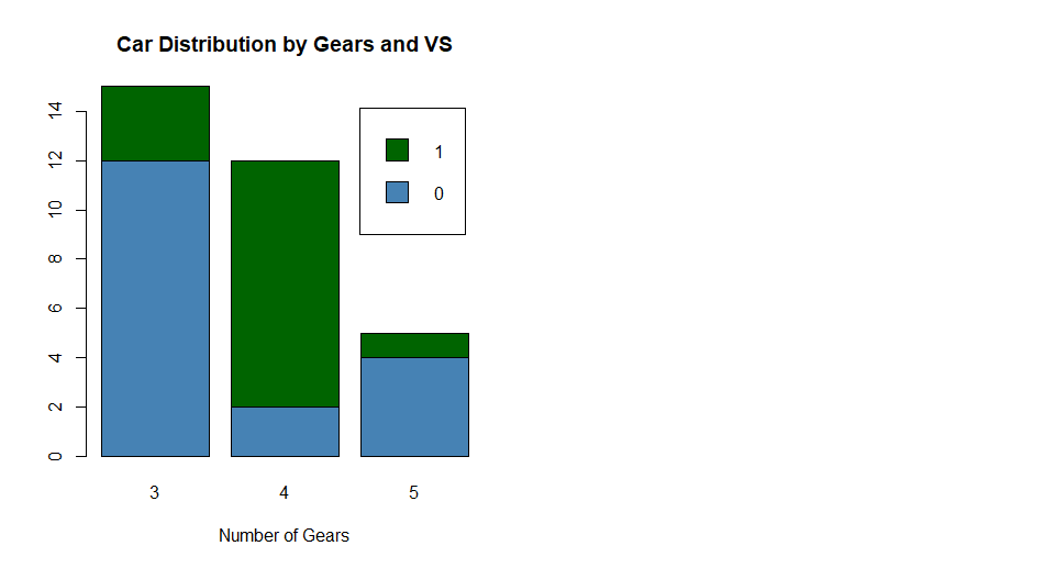
Stacked Barplot with Colors and Legend
# Stacked Bar Plot with Colors and Legend
counts <- table(mtcars$vs, mtcars$gear)
barplot(counts, main="Car Distribution by Gears and VS",
        xlab="Number of Gears", col=c("steelblue","darkgreen"),
        legend = rownames(counts))
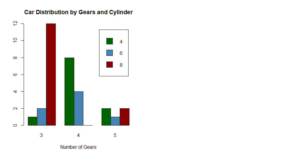
Grouped and colored Barplot
counts <- table(mtcars$cyl, mtcars$gear)
barplot(counts, main="Car Distribution by Gears and Cylinder",
        xlab="Number of Gears", col=c("darkgreen","steelblue", "darkred"),
        legend = rownames(counts), beside=TRUE)
Difference between Barplot and Histogram:
Barplots are good when your data is in categories (such as “Comedy”, “Drama”, etc). But when you have continuous data (such as a person’s height) then use a Histogram. It is best to leave gaps between the bars of a Bar Graph, so it doesn’t look like a Histogram.