| LM | Creating |
In Python, there are several libraries you can use to visualize charts and graphs. Here are some of the most popular options:
Different Types of Plots in Matplotlib
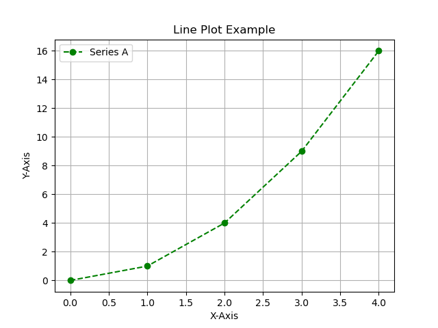
1. Line Plot
A library built on top of Matplotlib that makes it easier to create attractive statistical graphics.
import matplotlib.pyplot as plt

x = [0, 1, 2, 3, 4]
y = [0, 1, 4, 9, 16]

plt.plot(x, y, marker='o', color="green", linestyle="--", label="Series A")
plt.title("Line Plot Example")
plt.xlabel("X-Axis")
plt.ylabel("Y-Axis")
plt.grid(True)
plt.legend()
plt.show()
| Code | Shape | Description |
|---|---|---|
. |
Point | Small point marker |
o |
Circle | Circle marker |
v |
Triangle down | Downward triangle |
^ |
Triangle up | Upward triangle |
< |
Triangle left | Left-pointing triangle |
> |
Triangle right | Right-pointing triangle |
s |
Square | Square marker |
p |
Pentagon | Pentagon marker |
* |
Star | Star marker |
h |
Hexagon1 | Hexagon marker |
H |
Hexagon2 | Rotated hexagon marker |
+ |
Plus | Plus marker |
x |
Cross | Cross marker |
D |
Diamond | Diamond marker |
d |
Thin diamond | Thin diamond marker |
| |
Vertical line | Vertical line marker |
_ |
Horizontal line | Horizontal line marker |
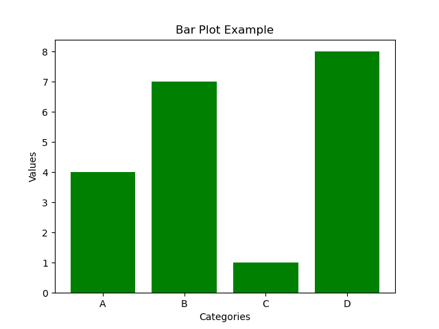
2. Bar Plot
A library for interactive graphics that allows you to create more complex visualizations.
import matplotlib.pyplot as plt

categories = ["A", "B", "C", "D"]
values = [4, 7, 1, 8]

plt.bar(categories, values, color="green")
plt.title("Bar Plot Example")
plt.xlabel("Categories")
plt.ylabel("Values")
plt.show()
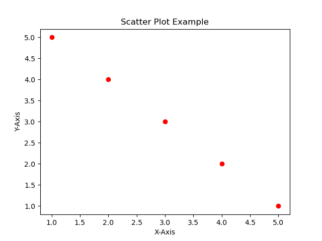
3. Scatter Plot
A scatter plot shows individual data points. It is used to observe relationships or patterns between two numeric variables.
import matplotlib.pyplot as plt

x = [1, 2, 3, 4, 5]
y = [5, 4, 3, 2, 1]

plt.scatter(x, y, color="red")
plt.title("Scatter Plot Example")
plt.xlabel("X-Axis")
plt.ylabel("Y-Axis")
plt.show()
4. Histogram
A histogram displays the distribution of numerical data by dividing it into bins. It helps to understand how data is spread or grouped.
import matplotlib.pyplot as plt

# Custom data points
data = [1, 2, 2, 3, 3, 3, 4, 4, 5]

# Create histogram
plt.hist(data, bins=5, color="skyblue", edgecolor="black")
plt.title("Histogram with Custom Data")
plt.xlabel("Value")
plt.ylabel("Frequency")
plt.show()
The bins parameter controls how many intervals (bars or “bins”) the data is divided into. bins=30 means: Divide the data into 30 equal-width intervals, and then count how many values fall into each interval. Each “bar” you see represents one bin.

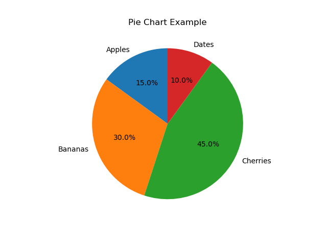
5. Pie Chart
A pie chart shows percentages or proportional data as slices of a circle.
import matplotlib.pyplot as plt

labels = ["Apples", "Bananas", "Cherries", "Dates"]
sizes = [15, 30, 45, 10]

plt.pie(sizes, labels=labels, autopct="%1.1f%%", startangle=90)
plt.title("Pie Chart Example")
plt.show()
autopct stands for “automatic percentage”.
It defines how to format the labels showing the percentage on each slice. “%1.1f%%” means: 1.1f → show the number with one decimal place (e.g., 23.5%). %% → the percent sign.
startangle=90
Sets the starting angle of the pie chart (where the first slice begins).
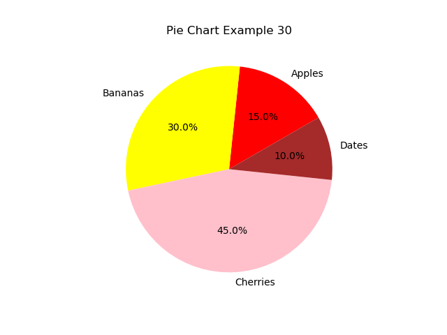
import matplotlib.pyplot as plt


labels = ["Apples", "Bananas", "Cherries", "Dates"]
sizes = [15, 30, 45, 10]
colors = ["red", "yellow", "pink", "brown"]


plt.pie(
    sizes,
    labels=labels,
    colors=colors,
    autopct="%1.1f%%",
    startangle=30
)

plt.title("Pie Chart Example 30")
plt.show()