
Creating graphs
“No design works unless it embodies ideas that are held common by the people for whom the object is intended.” - Adrian Forty
In Python, there are several libraries you can use to visualize charts and graphs. Here are some of the most popular options:
1. Matplotlib
One of the most well-known libraries for creating static, animated, and interactive graphics.
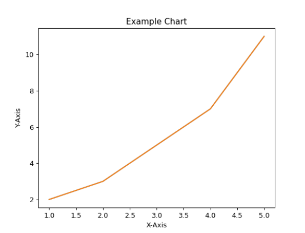
import matplotlib.pyplot as plt

# Example data
x = [1, 2, 3, 4, 5]
y = [2, 3, 5, 7, 11]

# Create chart
plt.plot(x, y)
plt.title("Example Chart")
plt.xlabel("X-Axis")
plt.ylabel("Y-Axis")
plt.show()
2. Seaborn
A library built on top of Matplotlib that makes it easier to create attractive statistical graphics.
import seaborn as sns
import matplotlib.pyplot as plt

# Example data
data = sns.load_dataset("iris")

# Create scatter plot
sns.scatterplot(x="sepal_length", y="sepal_width", data=data)
plt.title("Iris Dataset Scatter Plot")
plt.show()
3. Plotly
A library for interactive graphics that allows you to create more complex visualizations.
import plotly.express as px

# Example data
df = px.data.iris()

# Create interactive chart
fig = px.scatter(df, x="sepal_length", y="sepal_width", color="species")
fig.show()