Time Series
Although we already had contact with some temporal datasets, we did not have a closer formal look on time series. Time series datasets often inhibit some kind of autocorrelation, which is a no go for the models we have used so far. The first more formal contact with time series will therefore highlight these characteristics. The structure of this example follows Zuur et al. 2007 to a certain degree.
To exemplarily illustrate a time series analysis, air temperature records of the weather station in Cölbe (which is the one closest to Marburg) will be used. The data has been supplied by the German Weather Service.
Download the data
You can use the rdwd package for downloading the data or (if the package does not work..) download the data from the above linked DWD server.
library("rdwd")
url <- rdwd::selectDWD(id = "003164", res = "hourly", var = "air_temperature", per = "historical")
rdwd::dataDWD(url, dir = getwd(), read = FALSE)
A first look at the time series
The time series shows hourly recordings of 2m air temperature between 1 July 2006 and 31 December 2022.
# adapt path to where your file actually is and filename to the downloaded time span
path <- "produkt_tu_stunde_20060701_20241231_03164.txt"
dwd <- read.table(path, header = TRUE, sep = ";", dec = ".")
head(dwd)
##   STATIONS_ID MESS_DATUM QN_9 TT_TU RF_TU eor
## 1        3164 2006070100    3  12.9    91 eor
## 2        3164 2006070101    3  12.1    91 eor
## 3        3164 2006070102    3  11.8    93 eor
## 4        3164 2006070103    3  11.6    90 eor
## 5        3164 2006070104    3  11.7    91 eor
## 6        3164 2006070105    3  13.2    86 eor
tail(dwd)
##        STATIONS_ID MESS_DATUM QN_9 TT_TU RF_TU eor
## 144665        3164 2022123118    3  15.1    67 eor
## 144666        3164 2022123119    3  14.8    66 eor
## 144667        3164 2022123120    3  14.7    64 eor
## 144668        3164 2022123121    3  14.9    60 eor
## 144669        3164 2022123122    3  15.0    57 eor
## 144670        3164 2022123123    3  14.6    58 eor
In order to plot the dataset in a correct manner (i.e. without large gaps at the end of the year when e.g. 2006123123 switches to 2007010100),
the data can either be tranformed to a timeseries ts object or the date column can be converted to some kind of date format.
Since we will have a closer look on ts objects later, let us start with the date conversion.
dwd$DATUM <- strptime(dwd$MESS_DATUM, format = "%Y%m%d%H", tz = "UTC")
head(dwd$DATUM)
## [1] "2006-07-01 00:00:00 UTC" "2006-07-01 01:00:00 UTC"
## [3] "2006-07-01 02:00:00 UTC" "2006-07-01 03:00:00 UTC"
## [5] "2006-07-01 04:00:00 UTC" "2006-07-01 05:00:00 UTC"
Have a look at data summary:
summary(dwd)
##   STATIONS_ID     MESS_DATUM             QN_9       TT_TU
##  Min.   :3164   Min.   :2.006e+09   Min.   :3   Min.   :-999.000
##  1st Qu.:3164   1st Qu.:2.010e+09   1st Qu.:3   1st Qu.:   4.100
##  Median :3164   Median :2.014e+09   Median :3   Median :   9.500
##  Mean   :3164   Mean   :2.014e+09   Mean   :3   Mean   :   4.112
##  3rd Qu.:3164   3rd Qu.:2.018e+09   3rd Qu.:3   3rd Qu.:  15.600
##  Max.   :3164   Max.   :2.022e+09   Max.   :3   Max.   :  38.000
##      RF_TU             eor                DATUM
##  Min.   :-999.00   Length:144670      Min.   :2006-07-01 00:00:00.00
##  1st Qu.:  68.00   Class :character   1st Qu.:2010-08-16 01:15:00.00
##  Median :  84.00   Mode  :character   Median :2014-10-01 00:30:00.00
##  Mean   :  71.36                      Mean   :2014-10-01 00:19:01.64
##  3rd Qu.:  93.00                      3rd Qu.:2018-11-15 23:45:00.00
##  Max.   : 100.00                      Max.   :2022-12-31 23:00:00.00
Remove rows containing -999 in temperature or relative humidity.
dwd <- dwd[dwd$TT_TU != -999, ]
dwd <- dwd[dwd$RF_TU != -999, ]
Plotting is now easy:
plot(dwd$DATUM, dwd$TT_TU)
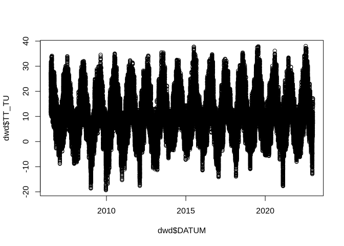
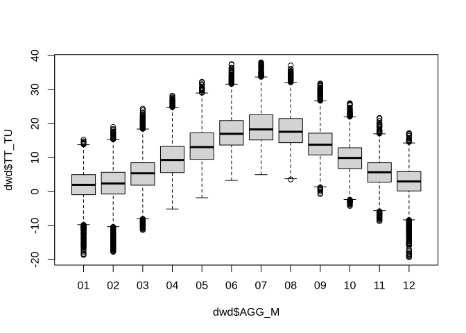
As one can see, there is a clear annual pattern (surprise, surprise). To have a closer look on this pattern, one simple option would be a set of boxplots showing the variation within each month over the entire dataset. To do so, the data in the boxplot has to be grouped by months, which requires a list indicating the class (i.e. month) each temperature record belongs to. The easiest way is to create an additional column in the data frame and copy the characters, which define the months in the original date column, to it.
dwd$AGG_M <- substr(dwd$MESS_DATUM, 5, 6)
boxplot(dwd$TT_TU ~ dwd$AGG_M)
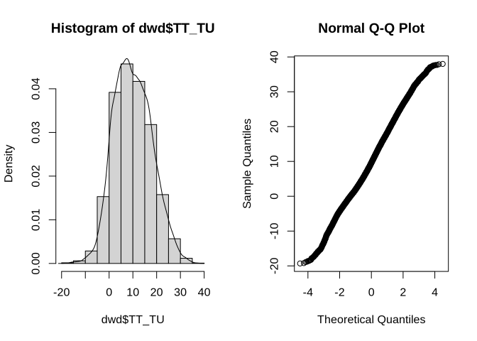
If you wonder about the distribution, you can use what we have learned so far:
par_org <- par()
par(mfrow = c(1,2))
hist(dwd$TT_TU, prob = TRUE)
lines(density(dwd$TT_TU))
qqnorm(dwd$TT_TU)
par(par_org)
Auto-correlation
So far, we always assumed that different observations are independent of each other - a concept which cannot be hold for many time series. Understanding auto-correlation is rather easy. It is the Pearson correlation we already know, but not computed based on two different datasets/variables. It is computed using the same time-series dataset with a temporal lag. For example, the auto-correlation for a lag of 1 would compare each original value observed at time t with the observed value at time t+1. A lag of 10 indicates that observation at time t is correlated with that at t+10 and so on. Please note that the number of available data pairs decreases (e.g. if the dataset has 30 observations, one has 29 pairs for lag 1 but only 1 pair for lag 30). Therefore, it does not make sense to try any possible lag, but restrict it to a few lags expected to be highly correlated (e.g. lag 12 for the monthly temperatures above).
While one can have a look at the actual correlation values, a visualization gives a better overview:
acf(dwd$TT_TU, lag.max = 100)
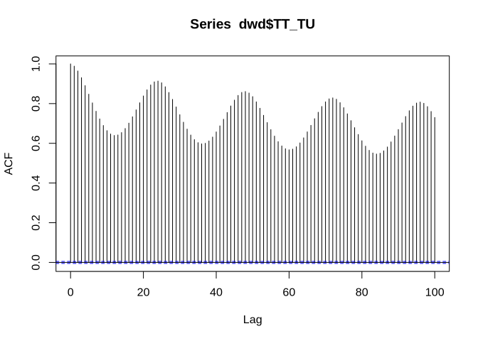
Since we have more than 143 thousand values available, we use a maximum lag of 100, although this is done mainly for illustration purposes. Obviously, we have strongest correlations at lags of 24 (i.e the correlation between hourly temperatures is highest if the temperatures are measured at the same time of day). While this holds true, the absolute correlation decreases if the number of days between the observations increases.
Another example shows the auto-correlation of the monthly mean temperatures for which we define an aggregation variable like the one above but now we include not only the month but also the year:
dwd$AGG_JM <- substr(dwd$MESS_DATUM, 1, 6)
tam <- aggregate(dwd$TT_TU, by = list(dwd$AGG_JM), FUN = mean)
colnames(tam) <- c("Date", "Ta")

# save data for later use
write.table(tam, file = "tam.txt", sep = ";", row.names = FALSE)

acf(tam$Ta)
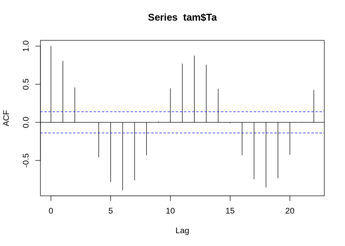
Now the seasonal pattern becomes evident with negative correlations with a lag of around 6 months (summer/winter, spring/autumn) and positive correlations with lags around 12 months. The blue lines indicate the significance corresponding to a p value of 0.05 if normality can be assumed. The latter is generally the case for time series longer than 30 to 40 values for which the central limit theorem becomes effective.
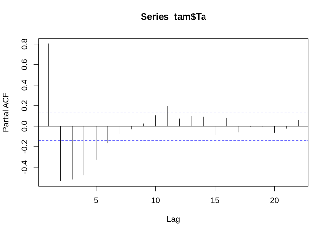
In addition to auto-correlation, we can also look at partial auto-correlation. The difference between these is that in the partial auto-correlation, the correlation between time lag t=0 and e.g. time lag t=t+10 is computed in such a manner that the influence of the auto-correlations in between is eliminated. This leads to quite different results. For example, if you have a strong auto-correlation with lag 5, then it is not surprising that t=0 is not only related to t=t+5 but also to t=t+5+5. The partial auto-correlation of our dataset looks like this:
pacf(tam$Ta)
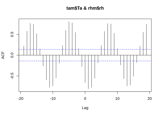
Of course, one can also have a look at cross-correlations including time lags. As an example, we use relative humidity, which is also part of the dataset.
rhm <- aggregate(dwd$RF_TU, by = list(dwd$AGG_JM), FUN = mean)
colnames(rhm) <- c("Date", "rh")

ccf(tam$Ta, rhm$rh)
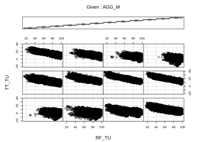
Similarly, air humidity is auto-correlated to air temperature. And this relationship is pretty much the same over all months:
coplot(TT_TU ~ RF_TU | AGG_M, data = dwd)
Auto-correlation analysis gives also a hint on stationarity. Stationarity is essential if one e.g. wants to predict future time series values based on auto-regressive or moving average models. Stationarity means that the time series has no trend and has similar variance over the entire time span. This is clearly not the case in the temperature data because of the strong seasonality regardless of any long term trend.