Analysis
Movement per Color
Results of general movement per color
The average number of recordings per individual per color shows that insects that landed on yellow were significantly more active (mean records 27.31) than those that chose the flower pattern (mean records 16.59; Table 1). However, the patterned plate exhibited both the highest maximum number of recordings (max records 3411) and the lowest standard deviation (SD 101.1). The yellow panels achieved the lowest maximum value (max records 2243) with a standard deviation of 143.8. The blue panels showed the highest standard deviation (170.1) among the color groups.
Table 1: The number of records per individual (track_ID) grouped by color chart with minimum number of records (min), maximum number of records (max), average number of records (mean) and the standard deviation of the number of records (sd).
| Color | mean | max | min | sd |
|---|---|---|---|---|
| Blue | 20.67 | 3303 | 1 | 170.14 |
| Flower | 16.59 | 3411 | 1 | 101.09 |
| Yellow | 27.31 | 2243 | 1 | 143.76 |
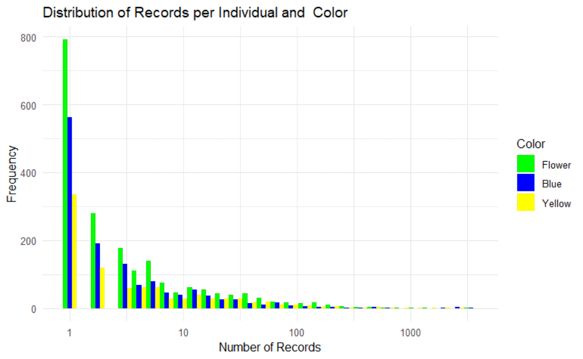
The representation (Fig. 8) illustrates the distribution of the number of records. Most individuals show record counts in the lower range between 1 – 10. From a record count of 100, only a few to isolated individuals are recorded.
The ANOVA analysis confirms the significant differences between the colors (p-value < 0.01, Table 2).
Table 2: The ANOVA variance analysis shows the significance of the differences between the colors.
| Df | Sum Sq | Mean Sq | F value | Pr(>F) | |
|---|---|---|---|---|---|
| Color | 2 | 42 | 20.95 | 10.64 | < 0.001 *** |
| Residuals | 4227 | 8323 | 1.97 |
A Tukey test can be used to separately illustrate the differences between the colors (Table 3). Here it is shown that yellow stands out from all groups (p-value < 0.01).
Table 3: The Tukey test shows the strength of the differences between the color groups.
| diff | lwr | upr | p adj | |
|---|---|---|---|---|
| Flower-Blue | 0.100 | -0.016 | 0.217 | 0.108 |
| Yellow-Blue | 0.278 | 0.136 | 0.419 | 0.001 |
| Yellow-Flower | 0.178 | 0.046 | 0.309 | 0.005 |
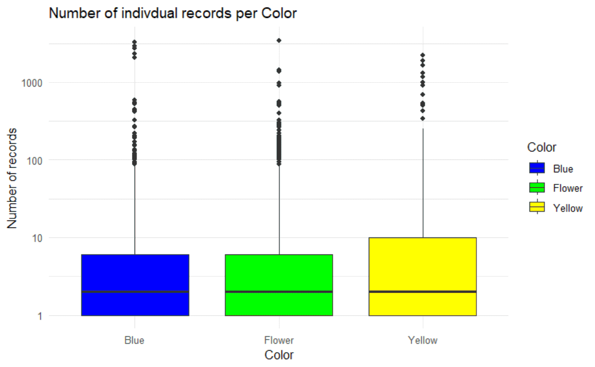
The results of the Tukey test can be visualized in a boxplot (Fig. 9). This shows both the difference of the groups to yellow and the data distribution from predominantly low numbers of records to isolated high numbers.
Conclusion: General movement per color
The colors differ significantly in their number of records per individual (p-value < 0.01). The average activity of the insects was lowest on the floral pattern plate (Records 16.6) and highest on the yellow monochrome plate (Records 27.3). Accordingly, insects that landed on the patterned plate were on average significantly less active than those that landed on the yellow plate. Despite the high maximum value, the standard deviation (SD) of the patterned plate was the lowest, making it the relatively most homogeneous dataset. The SD was highest for blue.
Results of specific movement per color
The ANOVA analysis shows that the detected species also have significant differences with regard to the number of records (p-value < 0.01, Table 4).
Table 4: The ANOVA variance analysis shows the significance of the differences between the animal categories.
| Df | Sum Sq | Mean Sq | F value | Pr(>F) | |
|---|---|---|---|---|---|
| top1 | 23 | 301 | 13.07 | 6.82 | < 0.001 *** |
| Residuals | 4206 | 8064 | 1.92 |
For a more precise movement profile, the movement activity per color chart can be broken down into the recognized “species” categories of the AI (Table 5). For blue, it is shown that ants moved the most on average (mean records 560.9), while butterflies (mean records 15.8) and bumblebees (mean records 1) were predominantly stationary. On the yellow plate, beetles (mean records 36.8) and flies (mean records 35.6) were most active, whereas ants (mean records 4.2) and bumblebees (mean records 2.6) were the calmest. Also on the patterned plate, flies (mean records 61.1) were active, and ants (mean records 3.9) as well as bumblebees (mean records 1.3) were calmer.
Table 5: The number of records per individual (track_ID) grouped by color chart and per AI-identified “species” with minimum number of records (min), maximum number of records (max), average number of records (mean) and the standard deviation of the number of records (sd).
| Color | Species | mean | max | min | sd |
|---|---|---|---|---|---|
| Blue | ant | 560.920000 | 3303 | 1 | 1105.7620268 |
| bee | 78.571429 | 520 | 1 | 194.6850937 | |
| bee_bombus | 1.000000 | 1 | 1 | 0.0000000 | |
| beetle | 17.027027 | 419 | 1 | 56.5646613 | |
| beetle_cocci | 3.818182 | 13 | 1 | 4.1908992 | |
| beetle_oedem | 2.500000 | 4 | 1 | 2.1213203 | |
| bug | 22.402299 | 446 | 1 | 67.9107588 | |
| bug_grapho | 1.500000 | 2 | 1 | 0.7071068 | |
| fly | 7.750000 | 13 | 1 | 4.9916597 | |
| fly_empi | 4.285714 | 9 | 1 | 2.6903708 | |
| fly_sarco | 2.000000 | 2 | 2 | NA | |
| fly_small | 10.134328 | 73 | 1 | 16.6468630 | |
| hfly_episyr | 14.500000 | 44 | 1 | 18.9985380 | |
| hfly_eupeo | 2.000000 | 3 | 1 | 1.0000000 | |
| hfly_sphaero | 6.500000 | 12 | 1 | 7.7781746 | |
| lepi | 15.811765 | 221 | 1 | 35.2523198 | |
| none_bg | 3.685057 | 75 | 1 | 6.9900939 | |
| none_bird | 17.065574 | 115 | 1 | 26.7655680 | |
| none_shadow | 7.959064 | 593 | 1 | 34.2387438 | |
| other | 19.933333 | 432 | 1 | 58.3240725 | |
| wasp | 27.666667 | 60 | 1 | 29.9054064 |
| Color | Species | mean | max | min | sd |
|---|---|---|---|---|---|
| Flower | ant | 3.895652 | 51 | 1 | 6.5230683 |
| bee | 1.454545 | 4 | 1 | 0.9341987 | |
| bee_apis | 8.200000 | 28 | 1 | 11.4324101 | |
| bee_bombus | 1.300000 | 2 | 1 | 0.4830459 | |
| beetle | 17.454054 | 1381 | 1 | 105.8346706 | |
| beetle_cocci | 1.500000 | 3 | 1 | 0.7071068 | |
| beetle_oedem | 9.476190 | 95 | 1 | 21.2640990 | |
| bug | 24.653595 | 918 | 1 | 90.7367012 | |
| fly | 11.296875 | 169 | 1 | 28.1332880 | |
| fly_empi | 28.617021 | 396 | 1 | 63.9390175 | |
| fly_sarco | 5.555556 | 31 | 1 | 9.8248551 | |
| fly_small | 15.623932 | 563 | 1 | 46.9937858 | |
| hfly_episyr | 4.666667 | 17 | 1 | 6.1535897 | |
| hfly_eupeo | 17.600000 | 83 | 1 | 36.5622756 | |
| lepi | 10.586826 | 306 | 1 | 33.1964299 | |
| none_bg | 20.322785 | 3411 | 1 | 195.0920912 | |
| none_bird | 11.000000 | 174 | 1 | 27.9942675 | |
| none_shadow | 9.896000 | 322 | 1 | 37.4596178 | |
| other | 21.507212 | 1436 | 1 | 94.4399341 | |
| wasp | 7.000000 | 7 | 7 | NA |
| Color | Species | mean | max | min | sd |
|---|---|---|---|---|---|
| Yellow | ant | 4.214286 | 30 | 1 | 5.9898503 |
| bee | 24.000000 | 94 | 1 | 38.5019480 | |
| bee_bombus | 2.600000 | 9 | 1 | 2.3664319 | |
| beetle | 28.308271 | 914 | 1 | 114.7385817 | |
| beetle_cocci | 3.000000 | 3 | 3 | NA | |
| beetle_oedem | 5.468085 | 103 | 1 | 15.2470255 | |
| bug | 7.463768 | 106 | 1 | 15.7765460 | |
| bug_grapho | 2.000000 | 2 | 2 | NA | |
| fly | 5.920000 | 35 | 1 | 8.7793318 | |
| fly_empi | 13.250000 | 76 | 1 | 22.5408985 | |
| fly_sarco | 1.333333 | 2 | 1 | 0.5773503 | |
| fly_small | 15.074074 | 339 | 1 | 48.2676703 | |
| hfly_eupeo | 8.000000 | 26 | 1 | 12.0830460 | |
| lepi | 19.230769 | 205 | 1 | 38.4190595 | |
| none_bg | 33.266667 | 1877 | 1 | 216.6959093 | |
| none_bird | 51.035714 | 1176 | 1 | 221.2729975 | |
| none_shadow | 60.435714 | 2243 | 1 | 247.1793748 | |
| other | 25.405797 | 1630 | 1 | 124.5253496 | |
| scorpionfly | 11.600000 | 29 | 1 | 14.1350628 |
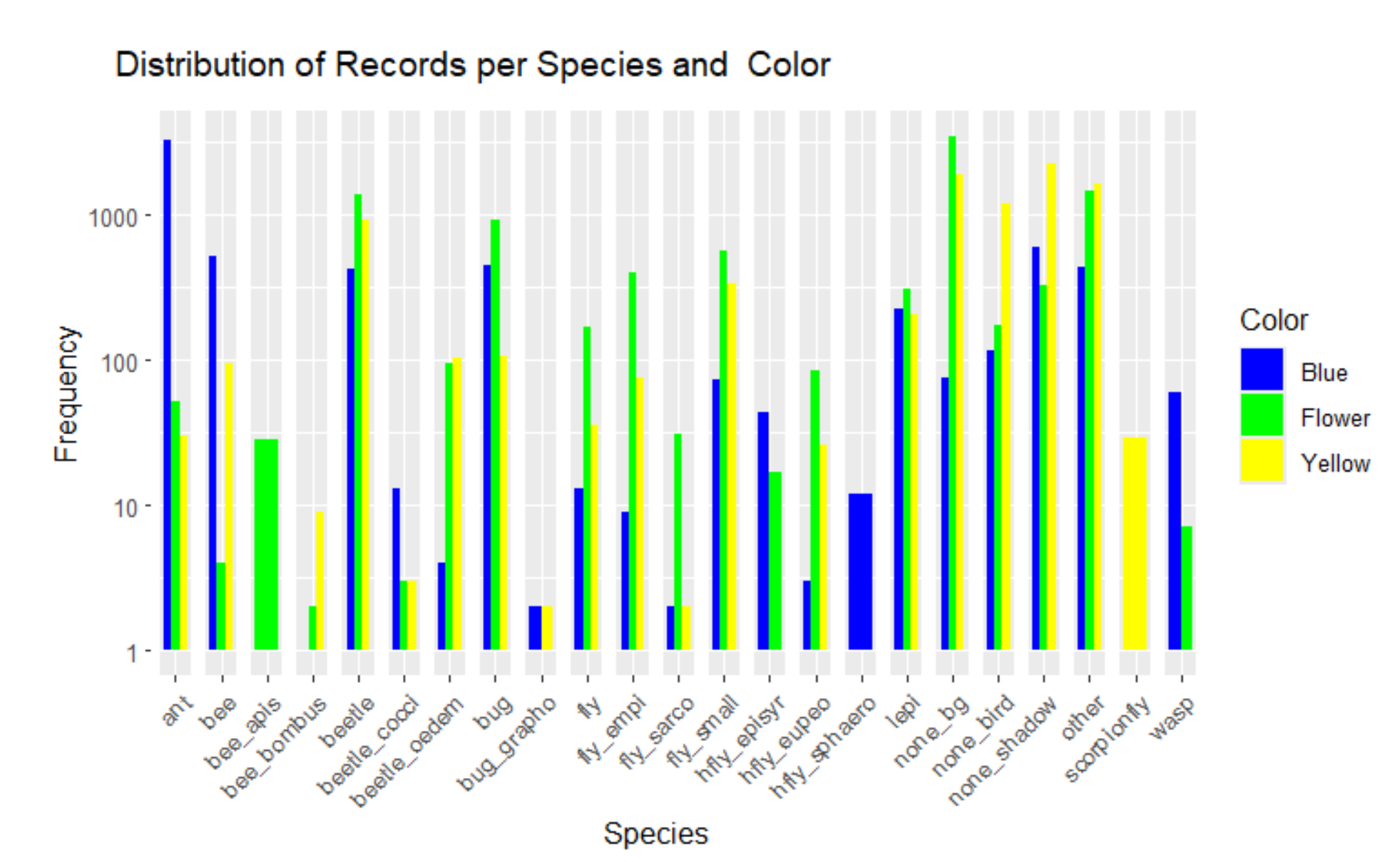
This comparison can be illustrated in the histogram (Fig. 10). Many groups seem to show higher movement activity on the yellow and patterned plates than on the blue one. Only ants and some bees were more active on the blue plate.
Conclusion: Specific movement per color
The blue plate differed significantly from the other plates in terms of insect activity. While a wide range of insect species was active on the yellow and patterned plates, ants predominated on the blue plate. Butterflies and bumblebees, on the other hand, showed hardly any movement here. On the yellow and patterned plates, beetles and flies in particular were very active, while ants and bumblebees were among the calmest groups here as well.
Dwell time per color
Results of general dwell time per color
In the following results section, it will be examined whether there is a correlation between the color of the plates and the dwell time of the individual insects on them.
First, for the three colors - blue, yellow, and floral pattern - the average, maximum, and minimum dwell time of the individuals recorded by the sensor box were calculated, as well as the standard deviation (Table 6). The dwell time was defined as the time an individual was recorded within the camera’s field of view, measured in seconds. For this purpose, the time between the first and last image of an insect was aggregated.
Table 6: Dwell time of individuals by color in seconds.
| Color | mean | max | min | sd |
|---|---|---|---|---|
| Blue | 49,71 | 3536,58 | 0 | 262,83 |
| Flower | 47,83 | 3536,15 | 0 | 181,31 |
| Yellow | 62,91 | 3252,52 | 0 | 250,74 |
The yellow plate showed the highest average dwell time of the insects of all colors (62.91 seconds). Blue is in second place (49.71 seconds), closely followed by the floral pattern (47.83 seconds). However, yellow has the shortest maximum dwell time of all colors (3252.52 seconds), but with a very small difference to the maximum dwell time of the colors blue (3536.58 seconds) and floral pattern (3536.15 seconds), which also differ by only one second. The minimum dwell time is the same for all three colors at 0 seconds, which means that these insects were only identified in one image. The standard deviation of blue (262.83 seconds) indicates a wide distribution of the data, meaning that there were both very short and very long dwell times of the insects. The same can be said for the color yellow (250.74 seconds). The floral pattern shows the lowest standard deviation of all colors (181.83 seconds), which means that the dwell time of the insects was less variable here than with the other colors.
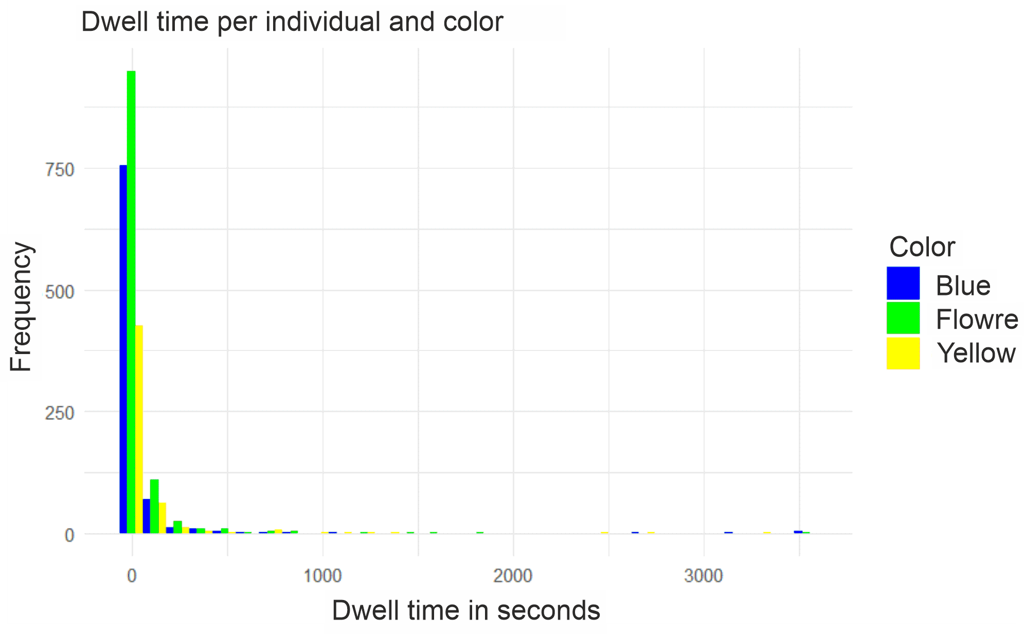
The histogram (Fig. 11) shows a sharp drop in the frequency of individuals with dwell time. This means that most individuals were recorded for a short period of time, while only a few individuals stayed on the plate for more than 250 seconds. This is most true for the floral pattern, followed by blue.
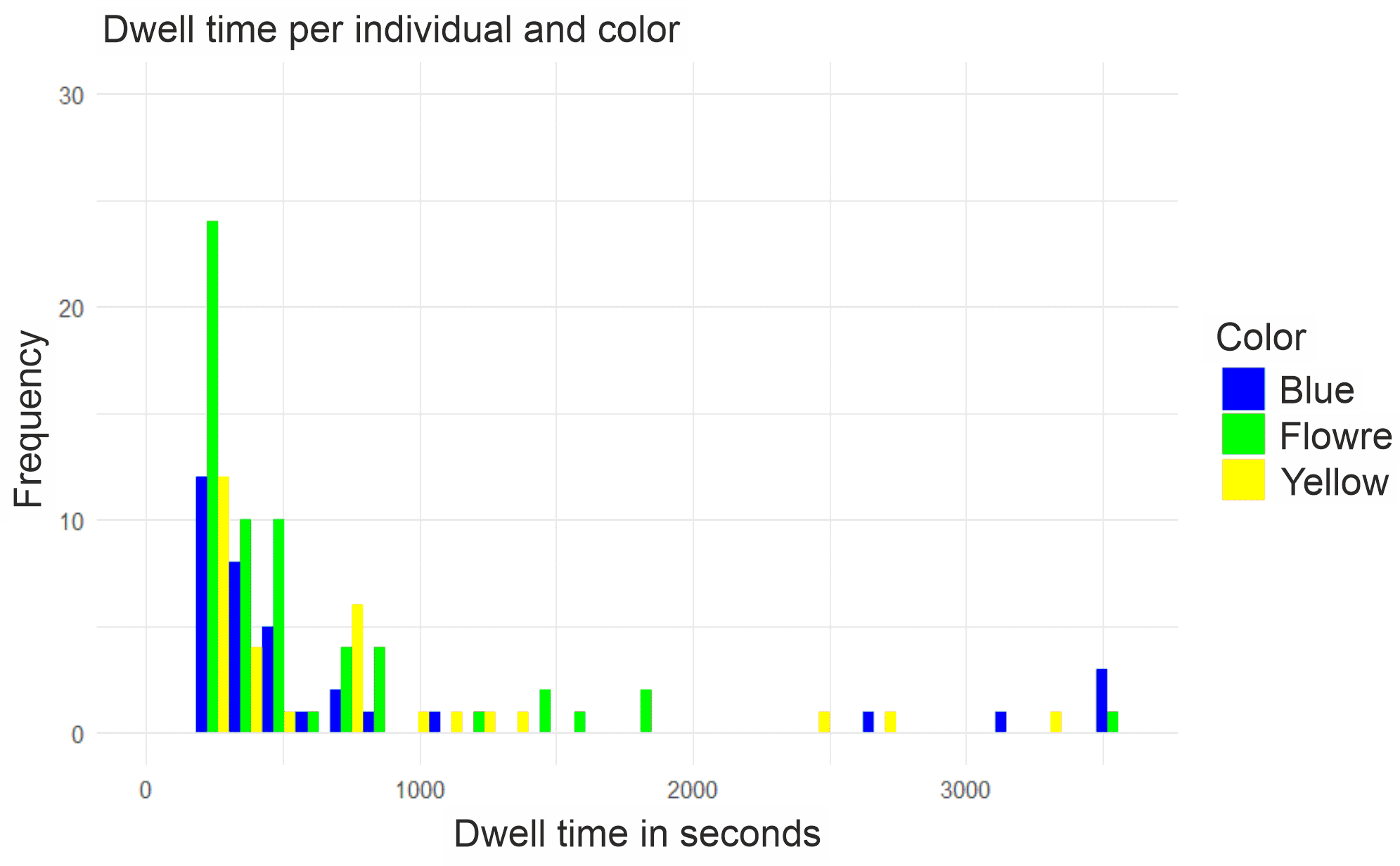
A representation of the histogram without considering the dwell time of one second (Fig. 12) shows that the majority of all recorded individuals only stayed on the plate for one recording. In this context, a significant decrease in frequency can be observed, falling from almost 1,000 individuals to about 25.
To determine whether there are significant differences in dwell time between the different colors, an analysis of variance (ANOVA) was performed. The ANOVA shows whether the differences in the mean dwell times between the colors are statistically significant. A p-value less than 0.05 indicates that at least one color has a significantly different dwell time.
Table 7: Results of the ANOVA (Analysis of Variance) to investigate the effect of color on the dwell time of insects with Df = degrees of freedom, Sum Sq = sum of squares, Mean Sq = mean squares, F value = F-value, Pr(>F) = p-value.
| Df | Sum Sq | Mean Sq | F value | Pr(>F) | |
|---|---|---|---|---|---|
| Color | 2 | 18 | 8.91 | 2.62 | 0.07 |
| Residuals | 2490 | 8470 | 3.40 |
The result of the ANOVA analysis (Table 7) suggests possible differences in the mean dwell times of the insects between the different colors, but these are not significant (F(2, 2490) = 2.62, p = 0.073). To further investigate the differences between the colors, a pairwise comparison was performed using Tukey’s HSD test (Table 8). Here too, the results show no significant differences between the individual colors:
Table 8: Tukey’s HSD test shows pairwise comparisons of the differences between the colors with diff = difference in means, lwr = lower confidence interval, upr = upper confidence interval, p adj = adjusted p-value.
| diff | lwr | upr | p adj | |
|---|---|---|---|---|
| Flower-Blue | 0.015 | -0.181 | 0.212 | 0.982 |
| Yellow-Blue | 0.217 | -0.024 | 0.458 | 0.088 |
| Yellow-Flower | 0.201 | -0.029 | 0.432 | 0.100 |
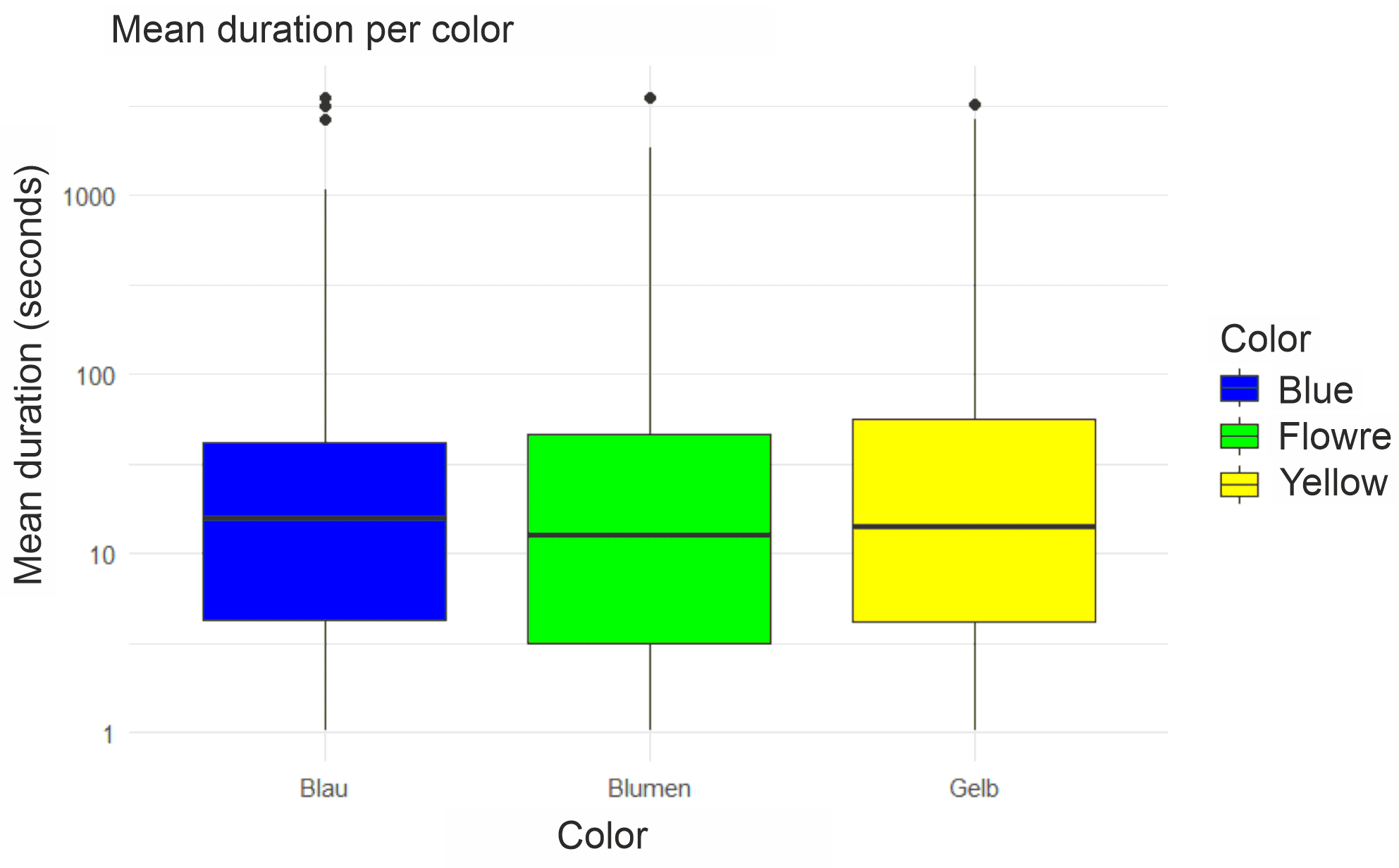
The boxplot (Fig. 13) also clearly visualizes that the individual colors hardly vary in average duration.
Results of specific dwell time per color
The ANOVA analysis shows significant differences in the dwell time (F(23, 4206) = 5.61, p = 2e-16) of the different species on the various colors, which is why this will be discussed again here.
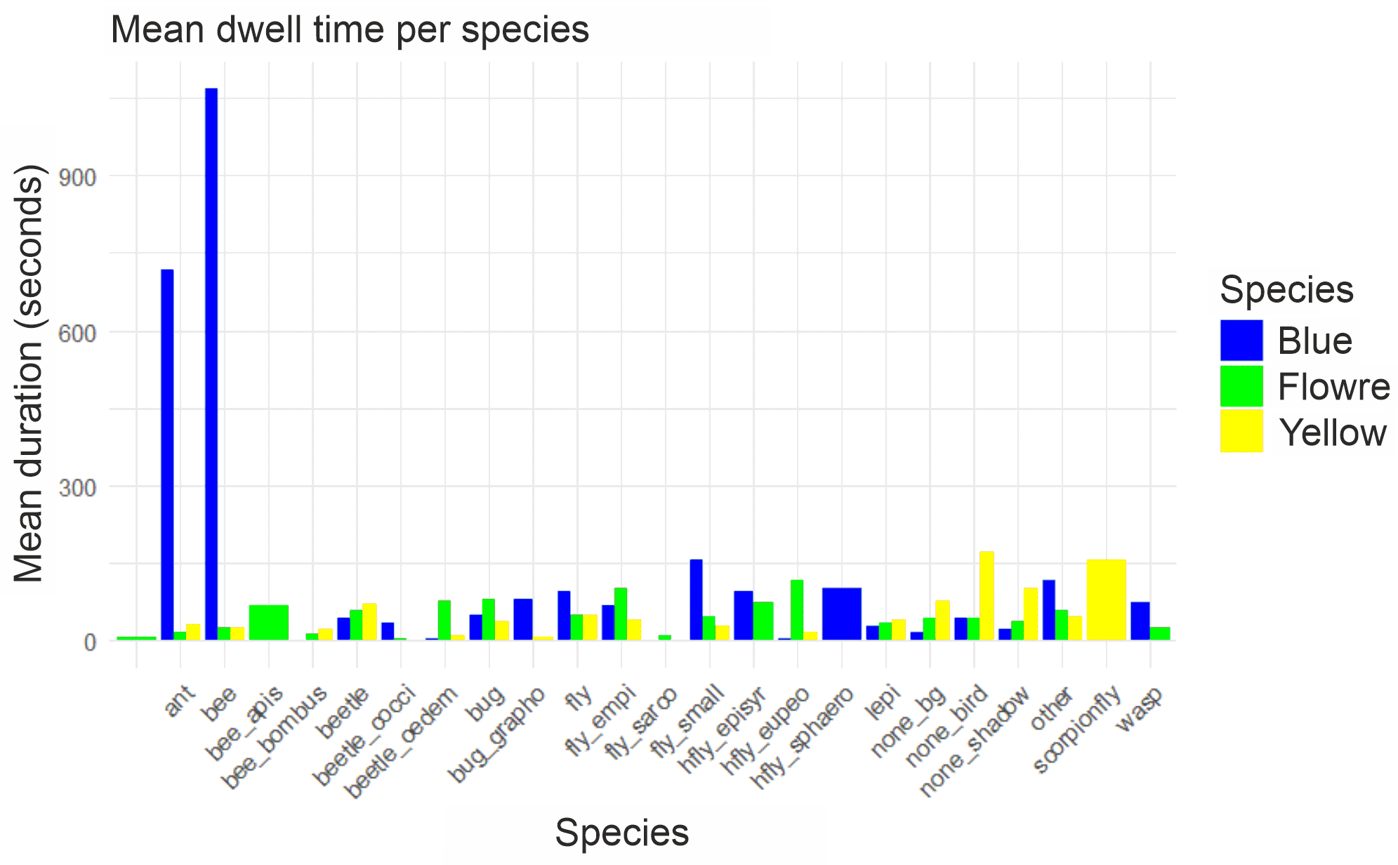
The histogram (Fig. 14) shows that ants stayed by far the longest on the blue plate, and hardly at all on the other colors (floral and yellow).
Bees also showed a very high dwell time on the blue plate (over 9000 seconds). Bees and ants show by far the longest dwell times of all species here. Some species only lingered on one color, such as the honeybee (apis) on green, the scorpionfly on yellow, and the Sphaeroceridae on the blue plate. The blue plates had the highest dwell time for most species, especially for bees and ants. Yellow plates were approached by some flies and other smaller insects, but the dwell time remains rather low compared to blue. Floral plates have a certain attraction for some beetle species and flies, but overall no extreme preference.
Number of insects per color
Results on the number of insects per color
This part of the analysis examines the relationship between the colors of the plates (blue, yellow, flower meadow) and the number of insects. Accordingly, the question of a significant impact on insects is investigated, and it is filtered out which color attracts the most insects, because the number of insects on a plate can indicate a preference for a color. The results of this analysis could simplify future decisions about materials with regard to a proximate sensing method and thus save costs.
Table 9: Number of insects on the respective colors with minimum number (min), maximum number (max), average number (mean) and standard deviation (sd).
| Color | mean | max | min | sd |
|---|---|---|---|---|
| Blue | 26.03 | 284 | 1 | 55.70 |
| Flower | 24.84 | 138 | 1 | 27.90 |
| Yellow | 13.23 | 49 | 1 | 12.48 |
The table (Table 9) shows how many insects were on each plate. The average was calculated using the maximum and minimum numbers. The standard deviation indicates the extent to which the number of counted individuals within a color category differ from each other and points to either homogeneity or heterogeneity. The standard deviation of the blue plate is the highest. This means that the heterogeneity, in terms of insect species, is highest on the blue plate. There were overall more insects on the blue plate, which differ in their genus. The fewest insects landed on the yellow plate, which were rather homogeneous among themselves with regard to the standard deviation. The floral plate is in the middle with its values.
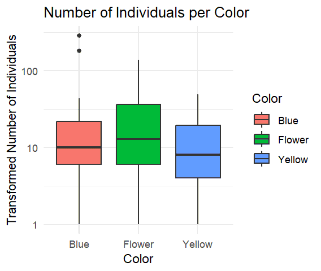
The diagram (Fig. 15) shows a boxplot representation of the number of individuals, divided into three categories based on the variable “Color”: Blue, Flower, and Yellow. While the x-axis displays the color, the y-axis represents the “Transformed Number of Individuals” on a logarithmic scale, meaning that the number of individuals is in a range between 1 and 100, with the values being represented logarithmically. The mean is represented by a thick line in the middle of the box, while the box shows the interquartile ranges (IQR, 25th to 75th percentile). The “whiskers” show the range in which most of the remaining data points lie, and any outliers are marked by points above or below the whiskers. The number of individuals in the blue category is in the middle range of the logarithmic scale (approximately 10 to 100). There are some outliers on the upper end, indicating that in some cases there is a significantly higher number of individuals in this category. The Flower category appears to have the broadest distribution, with the median being slightly higher than for the other colors. The values extend both below 10 and above 10 to near 100. The distribution of individuals in the yellow category is similar to the blue category, however, there are no outliers, and the median appears to be lower.
Conclusion: Number of insects per color
Looking at the boxplot representation, it can be seen that it is not the blue plate that is the most heterogeneous, but rather the “Flower” category has the broadest and most scattered distribution of the number of individuals. “Blue” and “Yellow” show a more compact distribution. It is possible that the blue category has some extreme values (the outliers), while yellow shows less variation overall.
A scattered distribution of the number of individuals means that the values within this group vary greatly, so both low and high values occur. In a boxplot, this is shown by a wider box, longer whiskers, and possibly the presence of outliers.
In the context of the diagram, this means for the “Flower” category that the number of individuals within this group varies greatly. There are individuals with low values (close to 1) and those with high values (close to 100), which indicates a wide spread of values and that there are many differences within the “Flower” group – some individuals were less frequently on the plate than others.
In comparison, the “Yellow” category shows a more compact distribution, which means that most individuals have a similar number, so there is less variation within this group.
Overall, a scattered distribution indicates that the number of individuals within a category is less homogeneous, while a compact distribution means that the values are closer together and the variability is lower.
Results on unique track counts per color
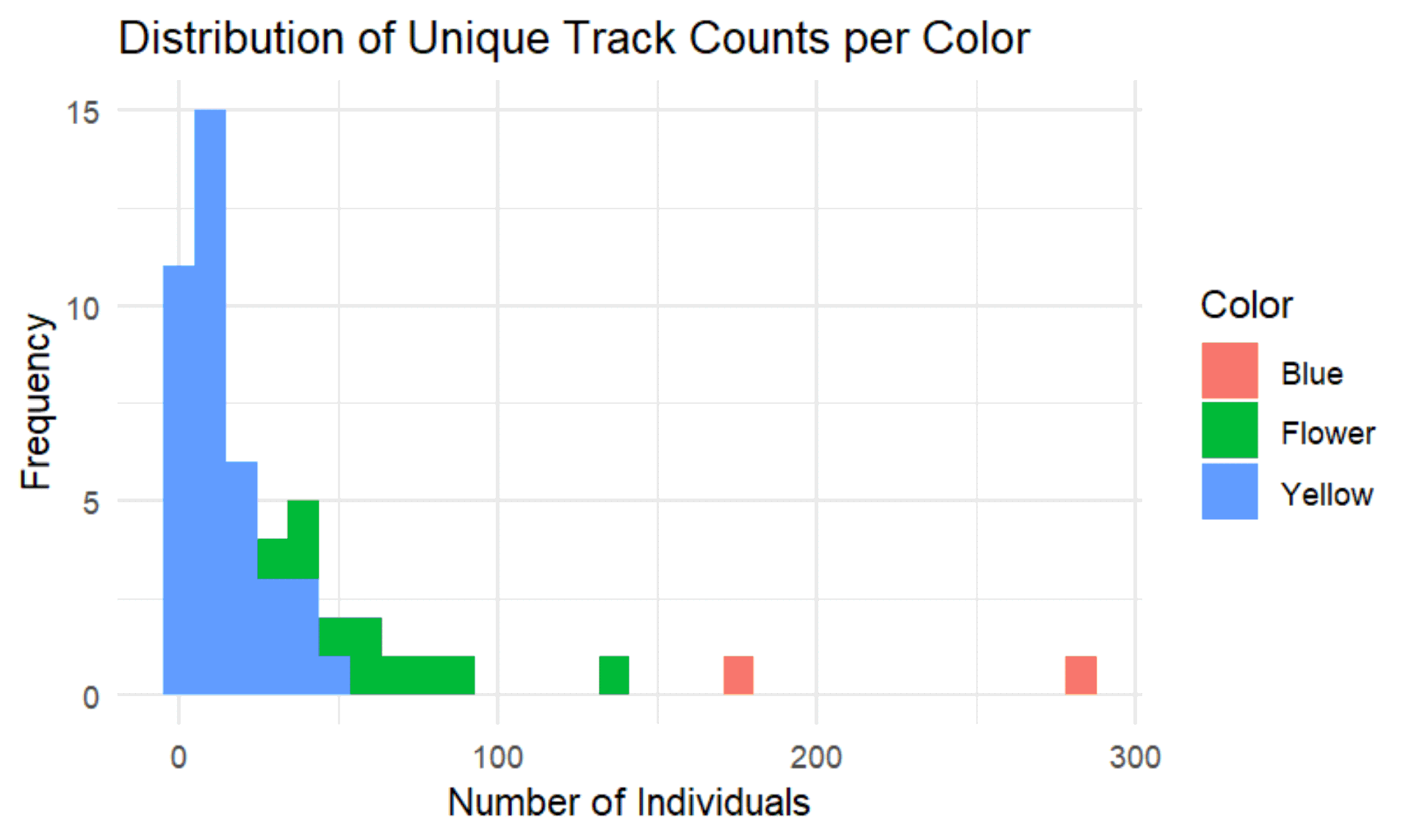
The diagram (Fig. 16) shows the “Distribution of the Number of Individuals per Color,” which is represented by three colors: Blue, Flower, and Yellow. It is a histogram that describes the frequency of “Unique Track Counts” for each color category. The x-axis (Number of Individuals) represents the number of individuals. The values range from 0 to over 300. The y-axis (Frequency) indicates the frequency, i.e., how often a certain number of individuals occurs in each color category.
The yellow plate dominates the range at low values (below 50 individuals). The frequency is particularly high when the number of individuals is very small, and then drops rapidly. There are no values at high numbers.
The distribution on the floral plate is less frequent than on the yellow plate, but there are several entries in the low range (around 50 and below). There are isolated values at higher counts (over 100 individuals).
The blue plate (note, shown in red here!) occurs only sporadically and shows values in a significantly higher range (at approximately 150, 200, and over 300 individuals).
Conclusion: Unique track counts per color
The yellow plate seems to have a very high number of individuals in the low range. This could indicate that this category predominantly consists of individuals that occur in small groups. Compared to blue, the Flower plate has a lower frequency, but also some entries at low counts. Interestingly, the Flower plate is also represented at larger numbers of individuals (over 100).
The blue plate shows a different distribution. There are hardly any individuals at low values here; instead, they occur more frequently at high counts. This category therefore consists more of larger groups or the same individuals that land on the plate more often.
While blue predominantly consists of small numbers of individuals, the yellow plate only has large values. This suggests that the individuals in the different categories differ greatly in their frequency.
The diagram suggests that the individuals on the blue plate are more heterogeneous and there is more variation, while on the yellow plate the same individuals occur more frequently, thus representing a more homogeneous group. The Flower plate occupies an intermediate position, with distributions in both the lower and upper ranges.