
Exercise: Fancy Data Visualization in R
Consider the following plot, which depicts the predictions which depicts the overall predictions on how different parties will fare in the EU elcetion 2024 and the final results in Hessia:
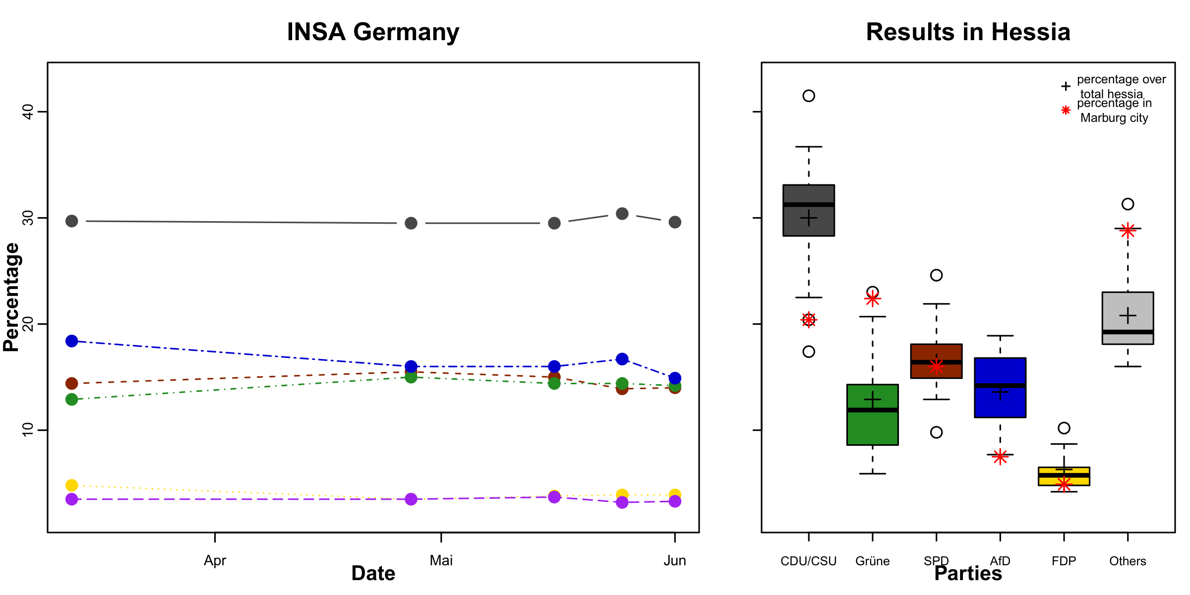
To create the right plot, download the data “HessiaErgebnisse” (results for Hessia) and “eu_election_forecast” from Ilias. IMPORTANT: The last two lines contain the information for whole Hessia in “HessenErgebnisse”, and the city of Marburg respectively - handle them accordingly.
Try to recreate the shown plot.
Useful tips for arranging plots can be found here: YaRrr
Also look here for the cheat sheet about margins with base R. https://r-graph-gallery.com/74-margin-and-oma-cheatsheet.html
You can save the plot later by running pdf(“EU_Election.pdf”, width = 8, height = 4) before your plot command and executing dev.off() after you have executed your plot command. Do this only when you are satisfied with your plot.