
| EX | Advanced visualization |
Advanced visualization in R
This section offers a practical exercise for those with a solid foundation in spatial data analysis. You will develop an advanced map in R using the tidyterra and ggplot2 packages to visualize tick bite distribution across Switzerland. This exercise will guide you through adding visual elements to communicate spatial data insights effectively.
Use the time to experiment with advanced plotting in R by creating a map using the tidyterra package.
To begin, download the tick bite distribution dataset and verify it by creating a basic plot. Use the provided URL to download the tick bite distribution map, then save it to your chosen local directory.
library(terra)
url="https://data.geo.admin.ch/ch.bag.zeckenstichmodell/zeckenstichmodell/zeckenstichmodell_2056.tif.zip"
file_path="C:/DATA/Lehre/moer-msc-advanced-SDM/data/"
file_name <- "zeckenstichmodell_2056.tif.zip"

# Call the download.file() function, passing in the URL and file name/location as arguments
download.file(url, paste(file_path, file_name, sep = ""), mode = "wb")
# unzip the file
unzip(paste0(file_path, file_name), exdir=file_path)
Load the unzipped file into R and create an initial plot using the terra package to ensure the data has loaded correctly. This plot serves as a baseline.
# load file into r with the terra package and plot
r=terra::rast(paste0(file_path, "ch.bag.zeckenstichmodell_2056.tif"))
terra::plot(r)
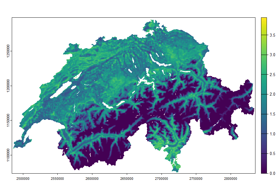
Datasource: BAG / A&K Strategy GmbH
Now that the data is loaded and verified, move to** tidyterra** and ggplot2 to generate a more flexible and customizable plot. Begin by using geom_spatraster() from the tidyterra package to map the spatial raster data. If your dataset has multiple layers, you could also use facet_wrap() to separate them.
To give you some ideas for the start here is a basic map with tidyterra:
library(tidyterra)
library(ggplot2)

ggplot() +
  geom_spatraster(data = r) +
  facet_wrap(~lyr)
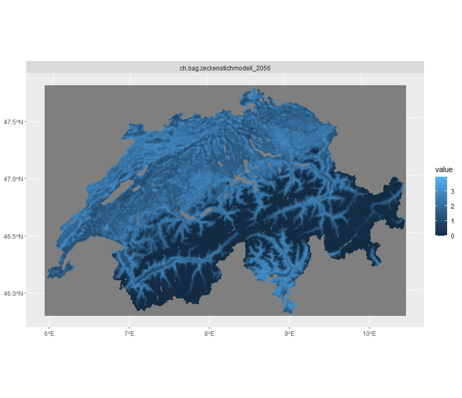
Datasource: BAG / A&K Strategy GmbH
Exercise:
Now, create a map with the following features:
- North Arrow: Add a north arrow to orient viewers.
- Scale Bar: Include a scale bar to indicate spatial resolution.
- Spectral Color Scheme: Apply a blue-to-red gradient (blue for low, red for high probability of species occurrence).
- Rename Raster: Add a clear header to the raster layer
Help and Resources: Have a look at the vignette of tidyterra and also use functionalities of ggplot2. And in doubt always ask stack overflow.
Expected output
Your map should look somewhat similar to this:
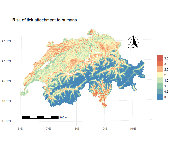
Datasource: BAG / A&K Strategy GmbH