Example: Visual Data Exploration
Visual data exploration should be one of the first steps in data analysis. In fact, it should start right after reading a data set. The following examples are based on a data set showing the quality and prices of diamonds More info
Within this example, we will focus on basic R graphics. Of course, all of the example could also be realized using more advanced plotting libraries like lattice or ggplot.
Have a look at the first few lines of the data.
head(diamonds)
## carat cut       color clarity depth table price     x     y     z
##  <dbl> <ord>     <ord> <ord>   <dbl> <dbl> <int> <dbl> <dbl> <dbl>
##1 0.23  Ideal     E     SI2      61.5    55   326  3.95  3.98  2.43
##2 0.21  Premium   E     SI1      59.8    61   326  3.89  3.84  2.31
##3 0.23  Good      E     VS1      56.9    65   327  4.05  4.07  2.31
##4 0.290 Premium   I     VS2      62.4    58   334  4.2   4.23  2.63
##5 0.31  Good      J     SI2      63.3    58   335  4.34  4.35  2.75
##6 0.24  Very Good J     VVS2     62.8    57   336  3.94  3.96  2.48
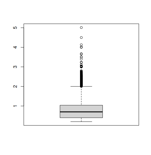
Boxplot
A boxplot is probably the most fundamental way to perform a visual data exploration. It generally shows the median along with the 25% and 75% quartiles (box and line within) as well as the value range which is within a range of 1.5 times the inter-quartile range (i.e. the size of the box which is also called spread). Values outside the latter range are indicated as outliers. All those settings can be changed.
Producing a boxplot is straight forward (the x-axis lables are just the column names):
boxplot(diamonds$carat)
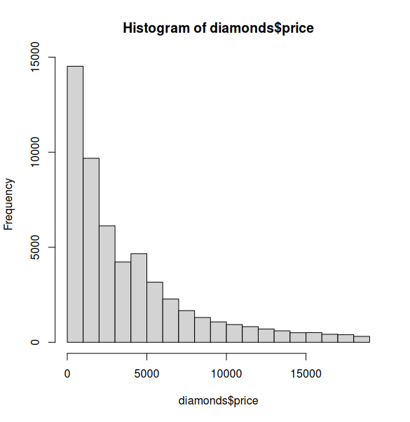
Histograms
Histograms are usefull for getting an idea of the distribution of the dataset. Visualization is straight forward:
hist(diamonds$price)
Scatterplot
Scatterplot, i.e. the mother of all plots, focuses on the relationship between variables. The x-axis should be used for the (more) independent variable, the y-axis for the (more) dependent variable.
Again, creating such a plot is very simple:
plot(x = diamonds$carat, y = diamonds$price)
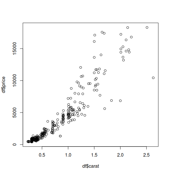
The axis lables are just the column names of the data frame but for this stage of data analysis, this is more than fine. If you finally decide which graphic should be included in a final presentation (e.g. publication), then the right time for nice lables and other stuff has come. But priot to that, pimping is just a waste of time.
An alternative for plot(x = , y = ) is the use of the ~ symbol. In R the ~ can be read as “in relation to”.
plot(diamonds$price ~ diamonds$carat)
This creates the same scatterplot as before. However the arguments are switches inside the function. Read it like this: plot the price as a function of carat. This logic sometimes makes it easier to be consistent with the modelling logic we will use in this course.